Adelique Africa
Adelique Africa supports children aged 8–13 through targeted literacy programmes. We redesigned its digital experience to build parent trust, clarify the programme offering, and reduce friction in enrollment.
The Challenge
Parents struggled to see the program's value and educators lacked tools to engage families.
The Solution
A unified website that builds trust, communicates value clearly, and simplifies participation.
The Impact
Streamlined enrollment, improved parent engagement, and a platform scalable for growth.
Objectives
Immediate Goals
- Retain current parents
- Grow the literacy club within existing schools
- Capture clearer feedback on program impact
Future Goals
- Attract more school principals
- Expand into broader youth support beyond literacy
Discovery
Listening to Parents and Educators
We started by understanding the real needs of Adelique Africa's two primary users: parents and educators through interviews, surveys, and a competitor scan.
Fast, easy communication is essential
Parents need quick, reliable ways to stay informed about their child's activities.
Parents want updates and proof of progress
Seeing tangible evidence of their child's development builds trust and retention.
Users want to supplement learning at home
Parents are eager to support literacy at home but lack accessible resources.
Upfront information reduces hesitation
Clear details about fees, schedules, and contacts prevent drop-offs before enrollment.
A simple enrollment process prevents drop-offs
Complexity in sign-up forms causes parents to abandon the process entirely.
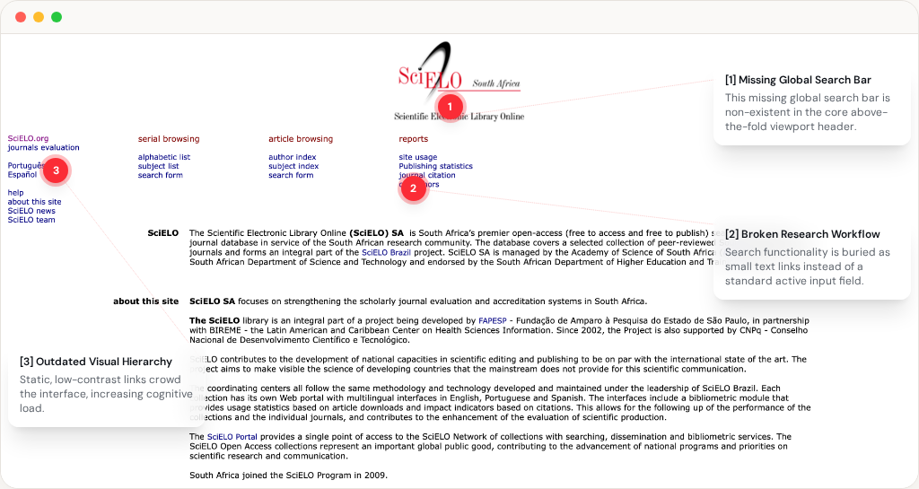
Parents had to piece together information across multiple touchpoints
The existing experience relied on a marketing flyer and a separate Google signup form, meaning parents had to move between different touchpoints to understand the programme and complete enrollment. The form also focused on collecting information rather than guiding parents through the decision to enroll, creating unnecessary friction at a critical point in the journey.
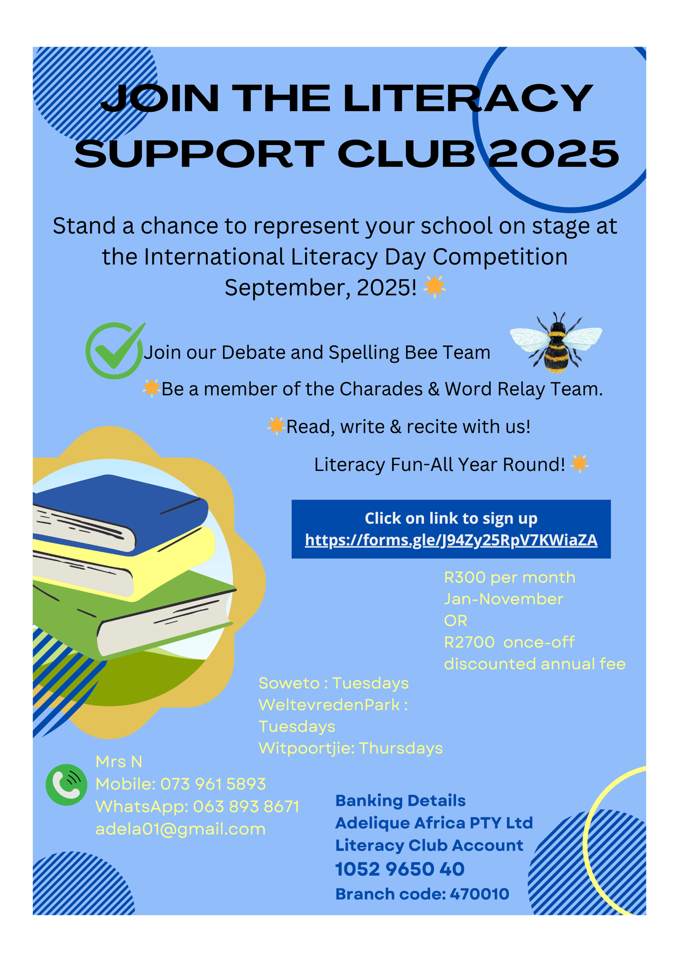
Flyer used for marketing
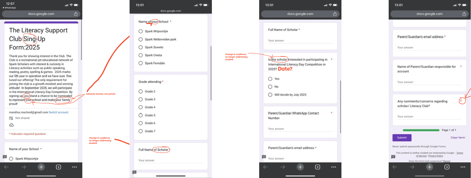
Original Google signup form
Define
Framing the Real Problems
We clustered insights using affinity mapping and distilled four key problem statements that shaped our entire design direction: communication, trust, visibility, and engagement.
Parents disengage without progress updates
Parents disengage when programs don't provide regular updates on their child's progress.
Unclear information erodes trust
Parents struggle to trust programs with unclear locations, fees, or contact information.
Educators lack engagement tools
Educators struggle to involve parents due to time constraints and limited tools.
No online presence breeds distrust
Educators distrust programs with no online presence, testimonials, or school-focused marketing.
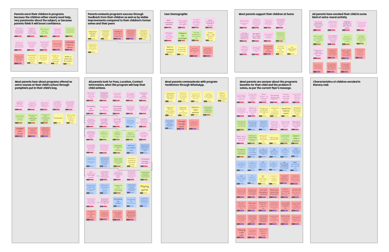
Affinity map showing common themes
Ideation
Turning Problems into Design Opportunities
With the key problems defined, we translated them into design opportunities. We focused on improving the moments where parents and educators experienced the most friction; from discovering information and enrolling to staying connected and building trust.
Smooth Enrollment
We saw an opportunity to solve parents' enrollment struggles by creating a direct, accessible path from discovery to sign-up.
- Microsite with essential info
- QR codes on flyers
- WhatsApp automation for sign-ups
Clarify Value
We saw an opportunity to make Adelique Africa’s value and child development benefits clearer to parents.
- Messaging tailored per learner type
- Benefit-driven copy focused on confidence and growth
Strengthen Communication
We saw an opportunity to keep parents informed about their child's progress through lightweight updates that don't burden educators.
- One-way WhatsApp updates
- Monthly progress reports
- Event highlights
Flyer Redesign
Limited flyer info failed to build parent confidence, creating an opportunity for a clearer, more convincing program entry point.
- Short, outcome-focused copy
- QR codes
- Full contact names for trust
Social Proof
Low online visibility hurt Adelique Africa's credibility, creating an opportunity to build parent trust by highlighting its impact.
- Real parent testimonials
- Instagram updates
- Meet the Team section with facilitator bios
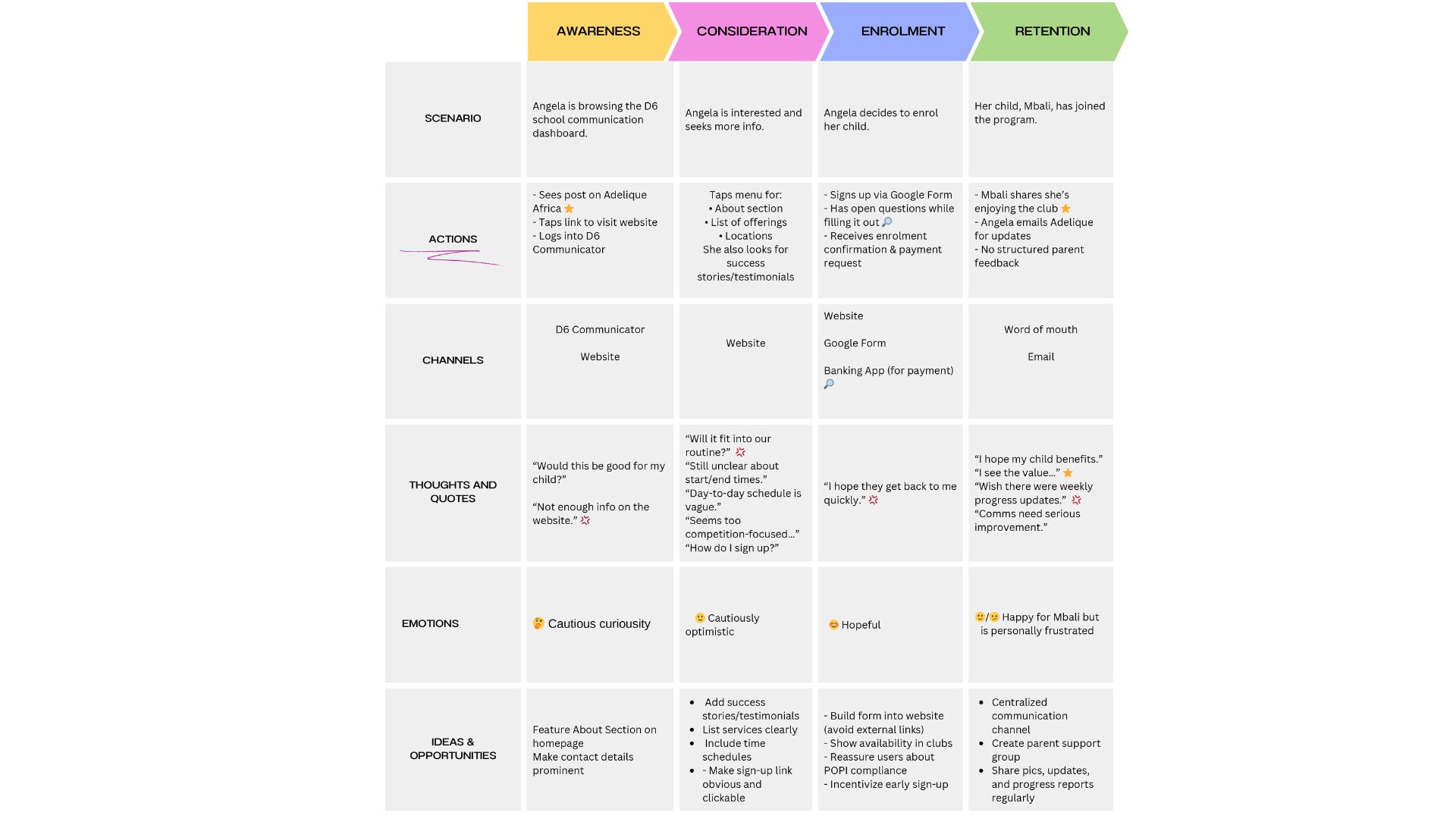
Journey map for Angela Brown, a parent confused at signup and frustrated at lack of communication by facilitators
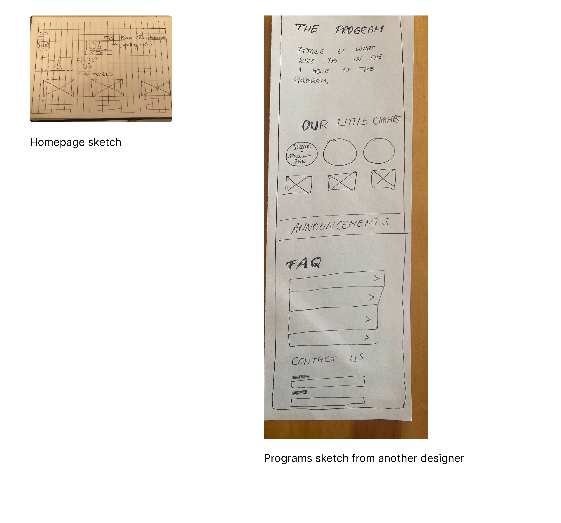
Early sketches of the homepage and programs page
Mid-Fidelity Wireframes
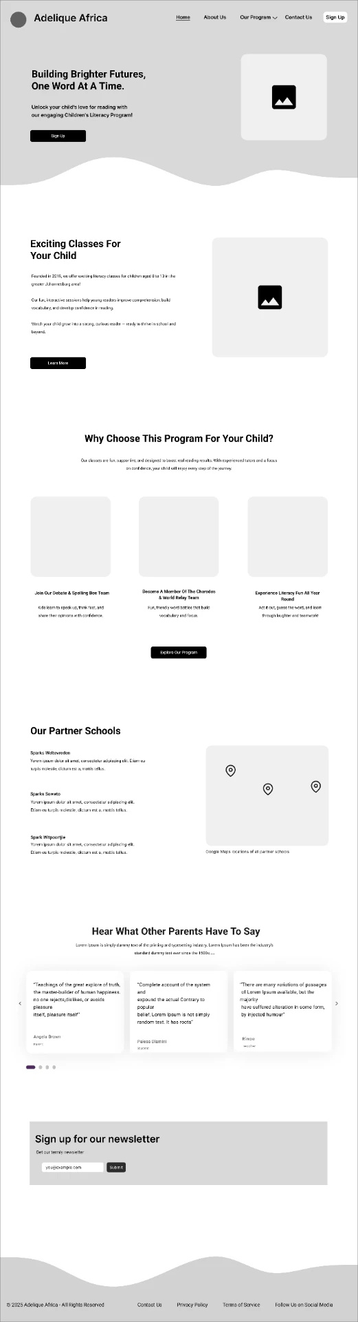
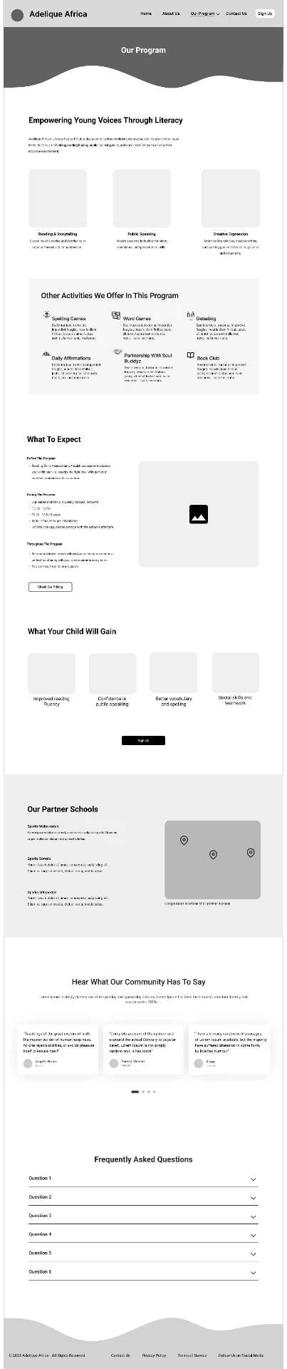
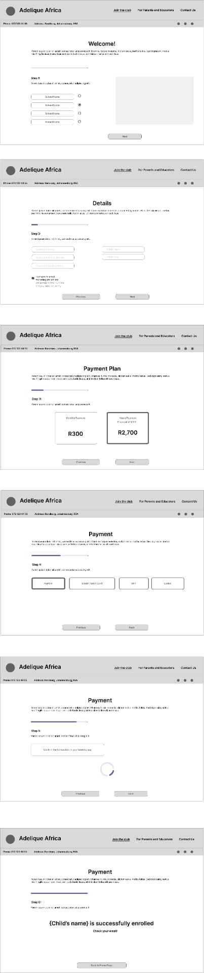
Mid-fidelity wireframes exploring structural layout, clear content hierarchy, and key features like partner school locations and the signup flow.
Testing
Testing, Learning, Iterating
Updates felt impersonal
Implemented WhatsApp group chats for timely, personal communication
Parents assumed program was online-only
Added 'current partner schools' section with clear in-person framing
Terms like 'termly' and 'once-off annually' confused parents
Simplified to 'per term' and 'per year'
Enrollment flow was too long
Streamlined to a 3-step flow to reduce drop-off
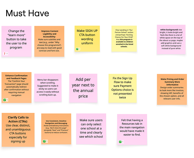
Prioritised updates from usability testing
Design
Design & Delivery
The final designs translated research and usability testing insights into a clearer, more trusted and engaging experience for parents and children.
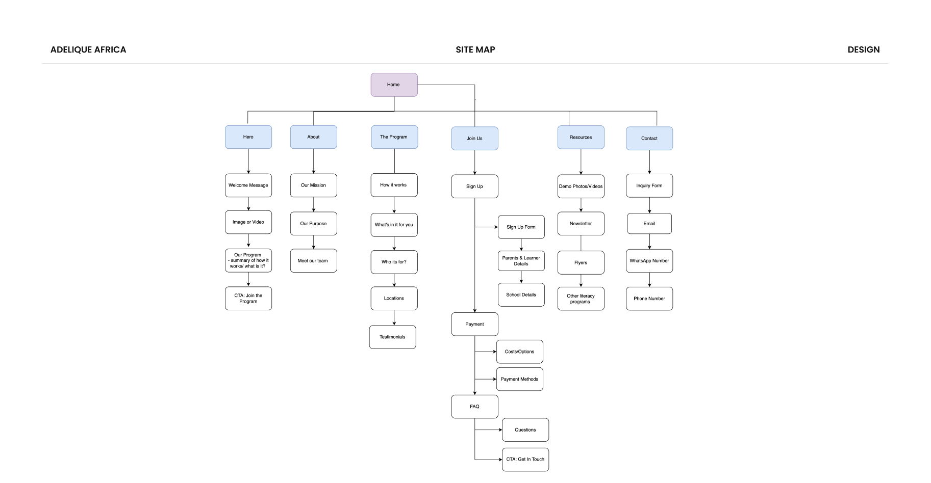
Sitemap
Visuals
Stars, moons, and suns symbolised growth and imagination. Child-reading photos framed in celestial shapes kept joy central.
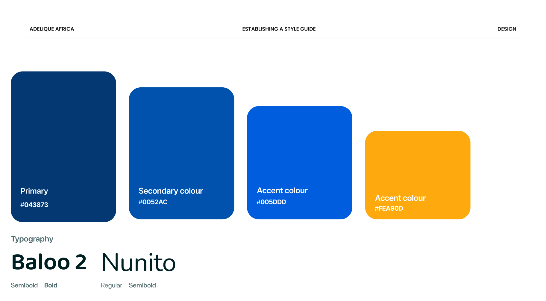
Colours
Warm yellows and calming blues built trust and comfort. Bright accents highlighted key actions.
Typography
Rounded headline fonts added playful energy. Clean body text ensured readability for parents on the go.
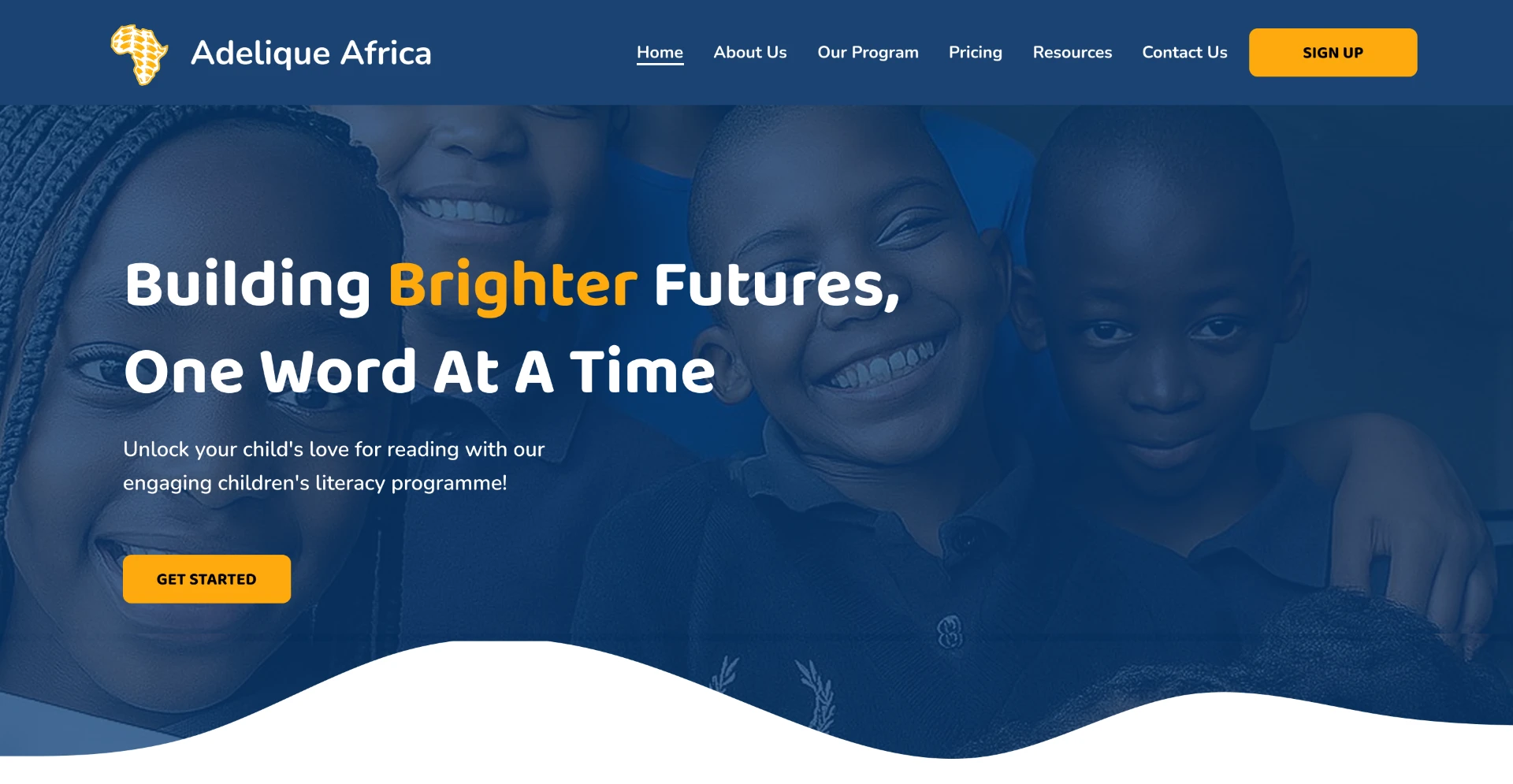
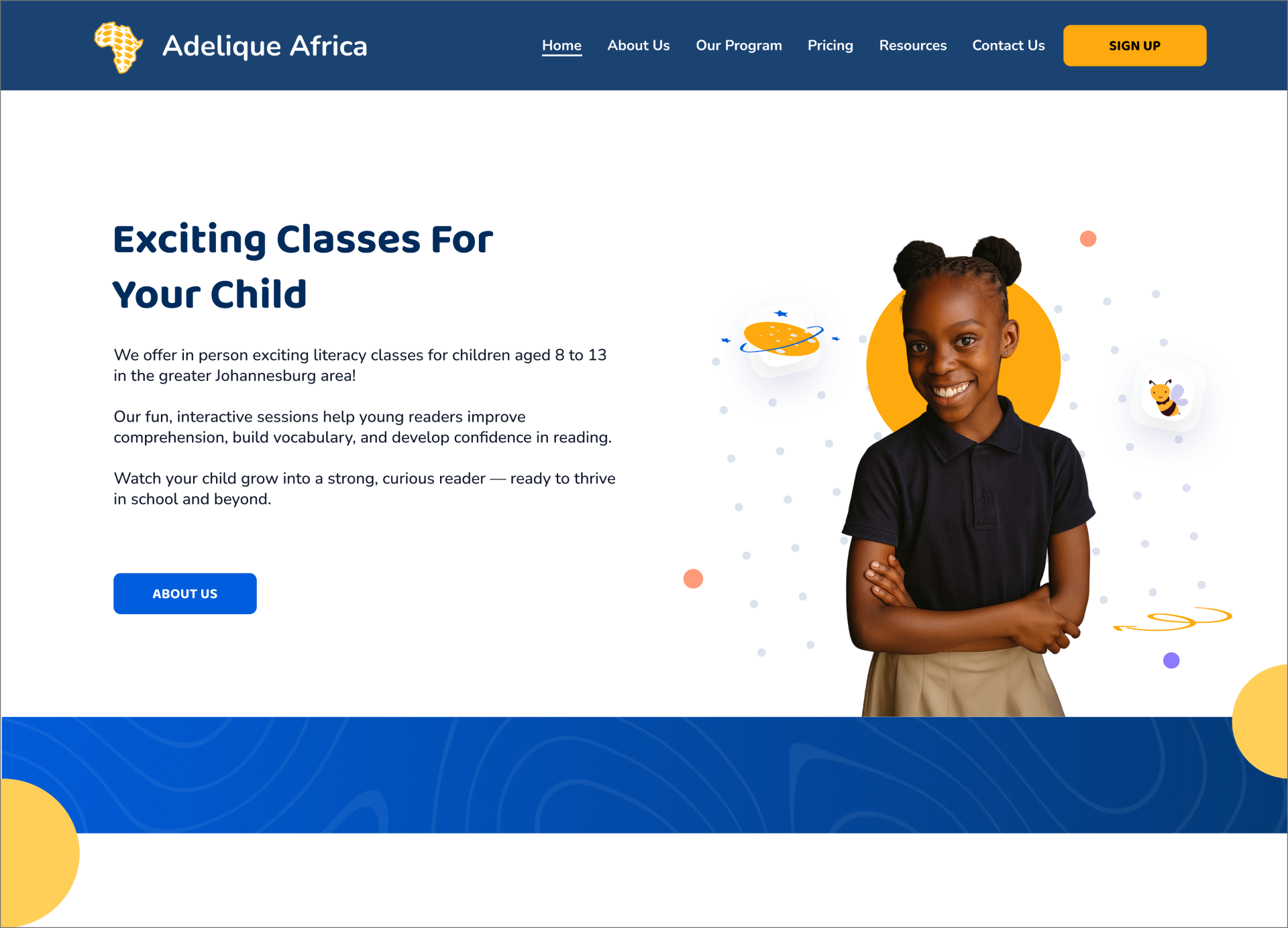
Homepage — Trust & Welcome
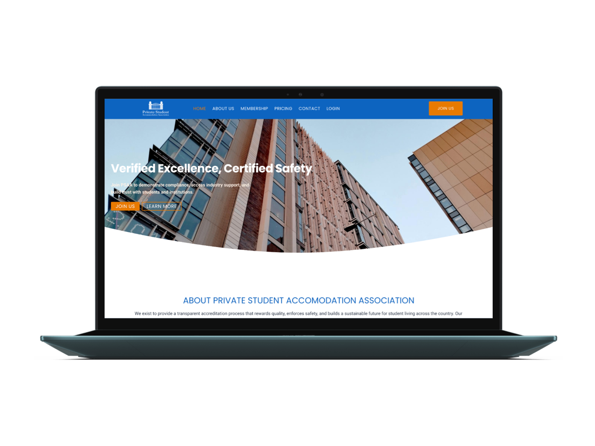
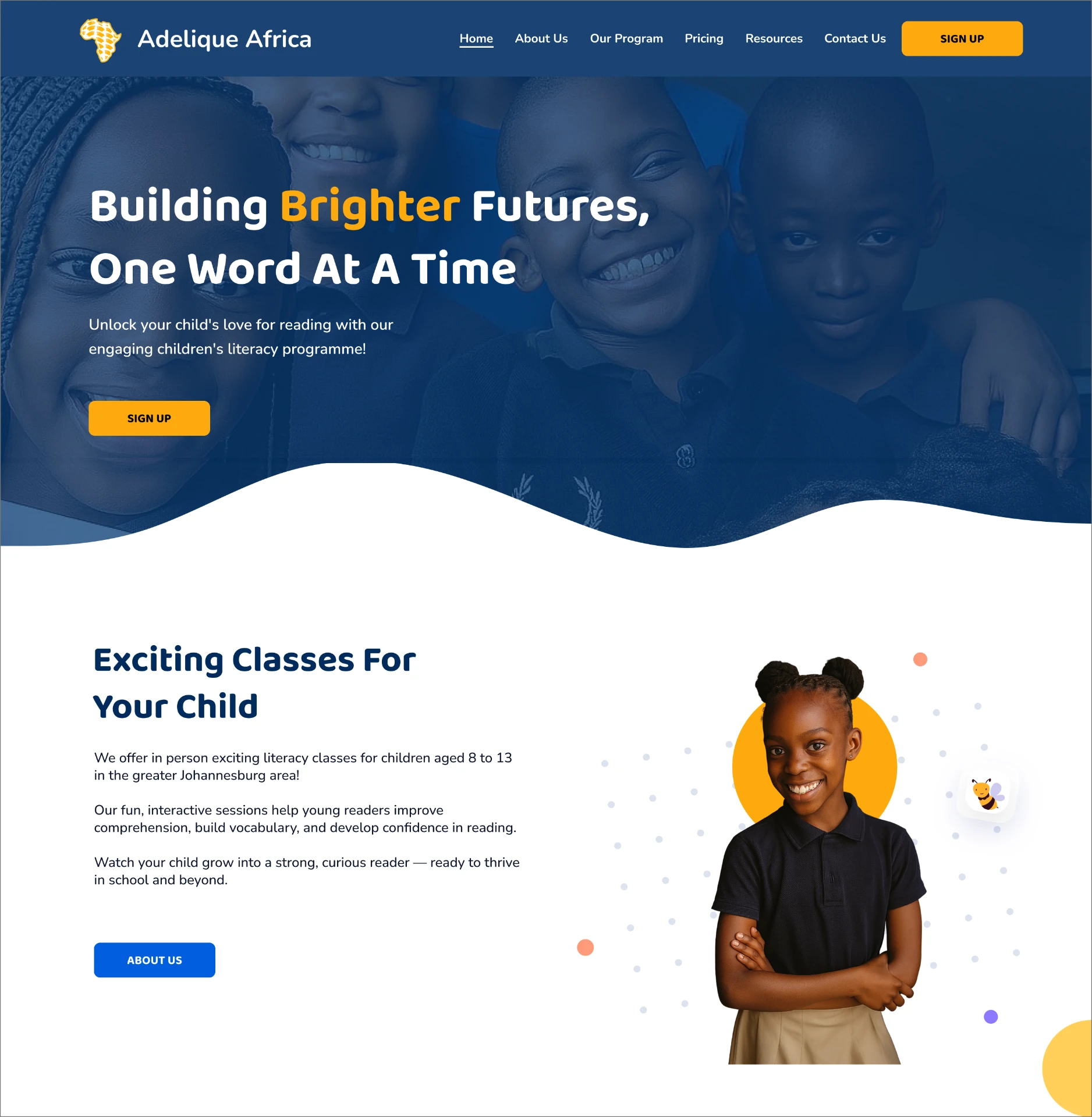
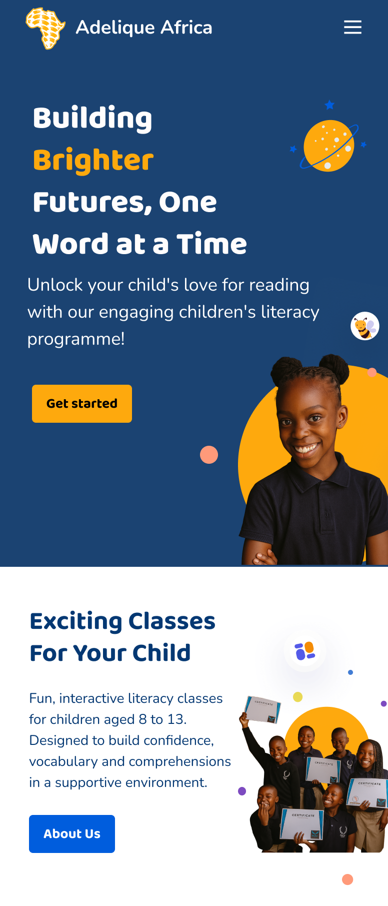
We designed a warm hero section leading directly with the program's mission, responding to our insight that unclear, purely functional messaging (like the original flyer) was eroding parent confidence before they'd even explored the site. Below it, celestial-themed imagery (stars, moons, planets) carried that same sense of joy and imagination through the rest of the page, keeping the tone warm rather than purely informational.
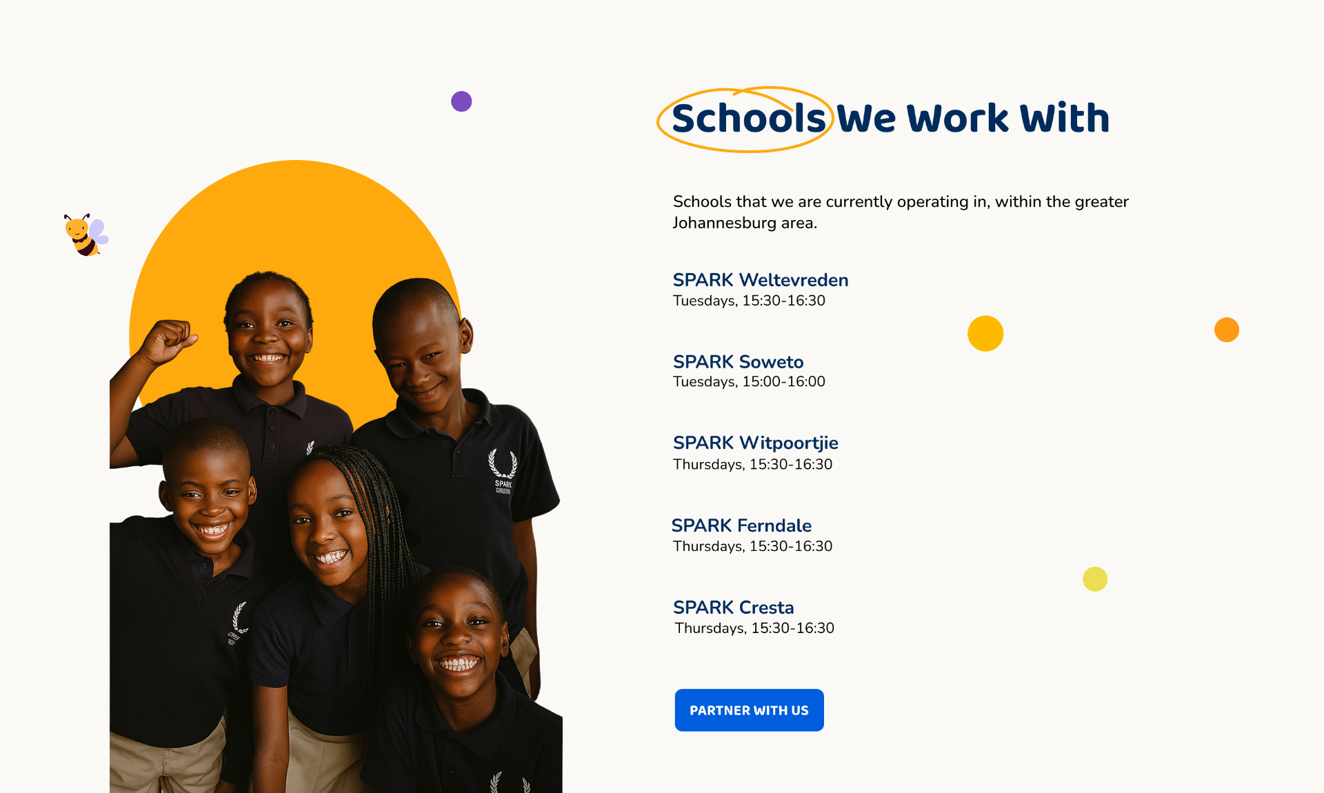
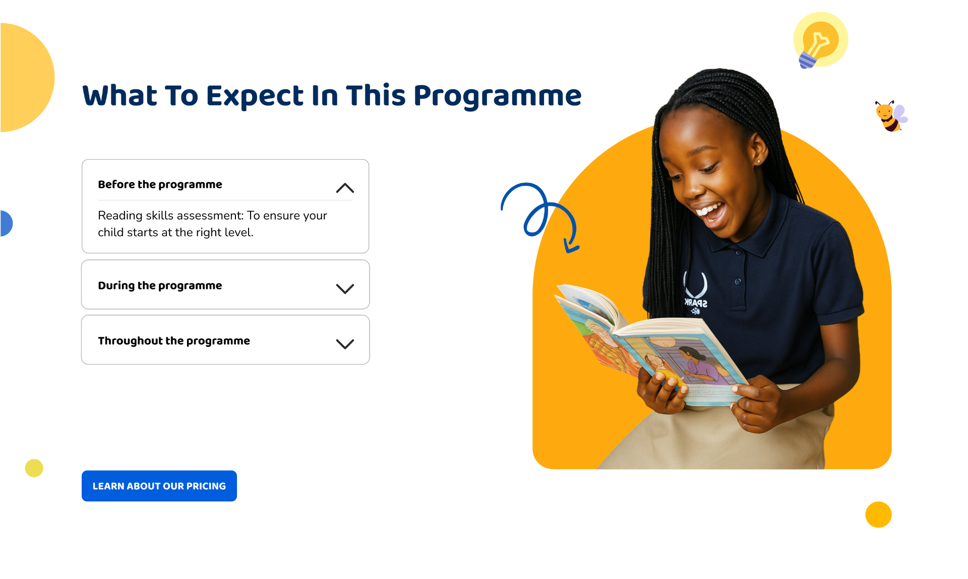
Programs Page — Clarity & Structure
This page laid out weekly activities, partner schools, and program format in a single, scannable structure; addressing a specific insight from research: parents assumed the program was online-only, since there was no clear indication of an in-person format. We added a dedicated "current partner schools" section to correct that assumption, alongside a "What to Expect" breakdown (before, during, and throughout the program) so parents could understand the full commitment upfront rather than discovering details bit by bit.
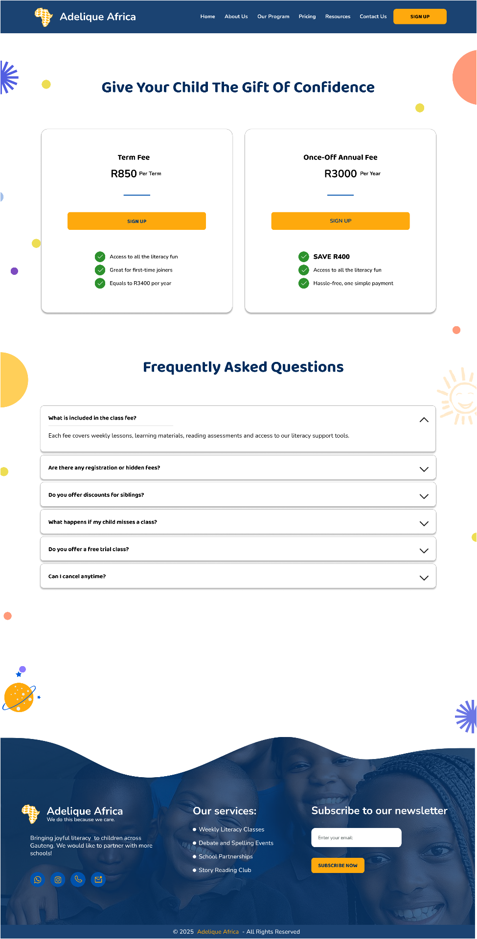
Pricing Page — Transparent Fees
Research surfaced a clear trust problem: parents struggle to trust programs with unclear locations, fees, or contact information. I designed the pricing page in direct response to this, giving it its own dedicated space rather than burying costs inside the sign-up form, so parents could see exactly what the program cost before starting enrollment. This reduced the risk of parents abandoning the process after investing time filling in the form, only to be surprised by cost at the end. (Final visual implementation, aligned to the site's design system, was completed by another team member.)
Signup Flow — Simplified Enrollment
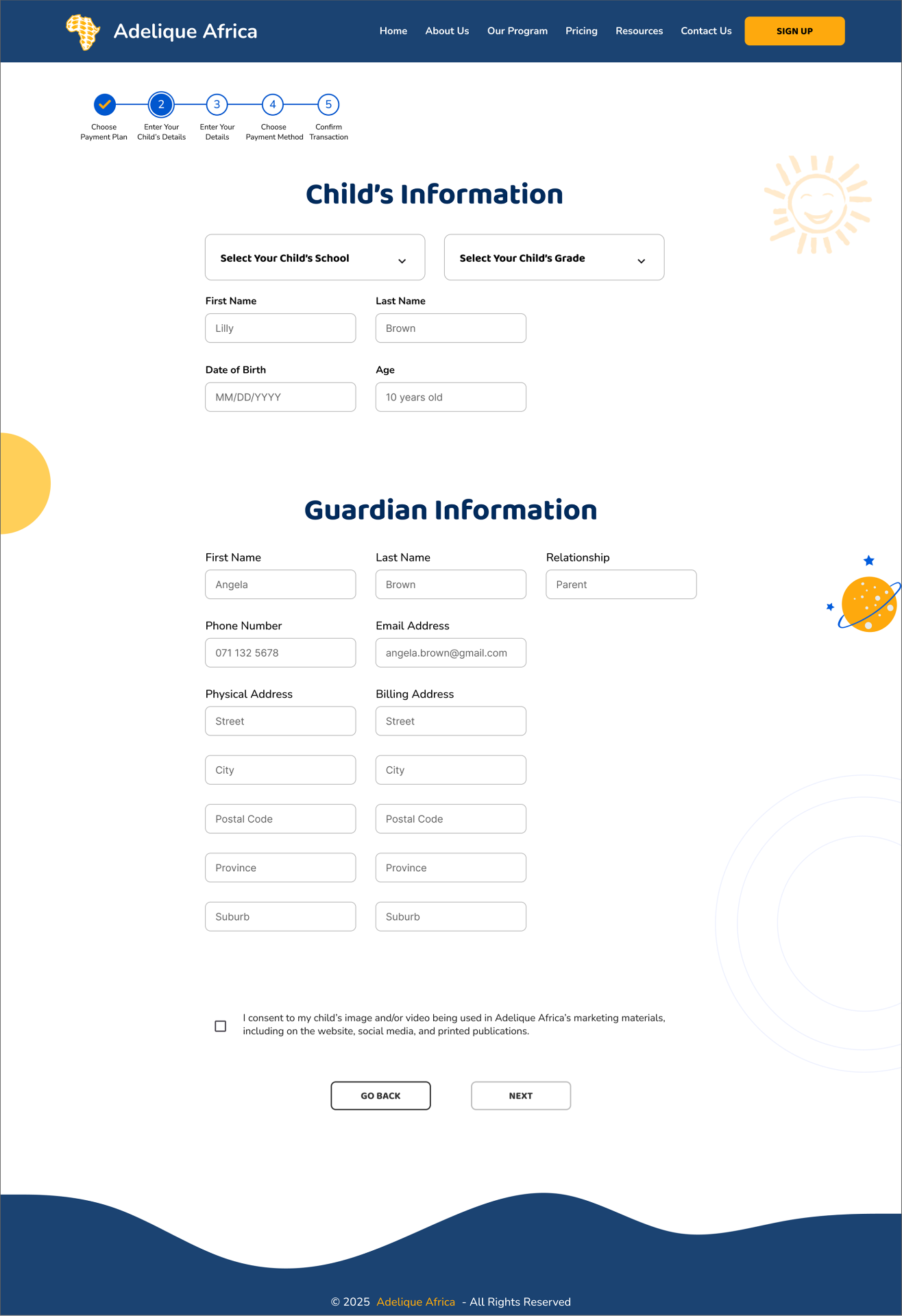
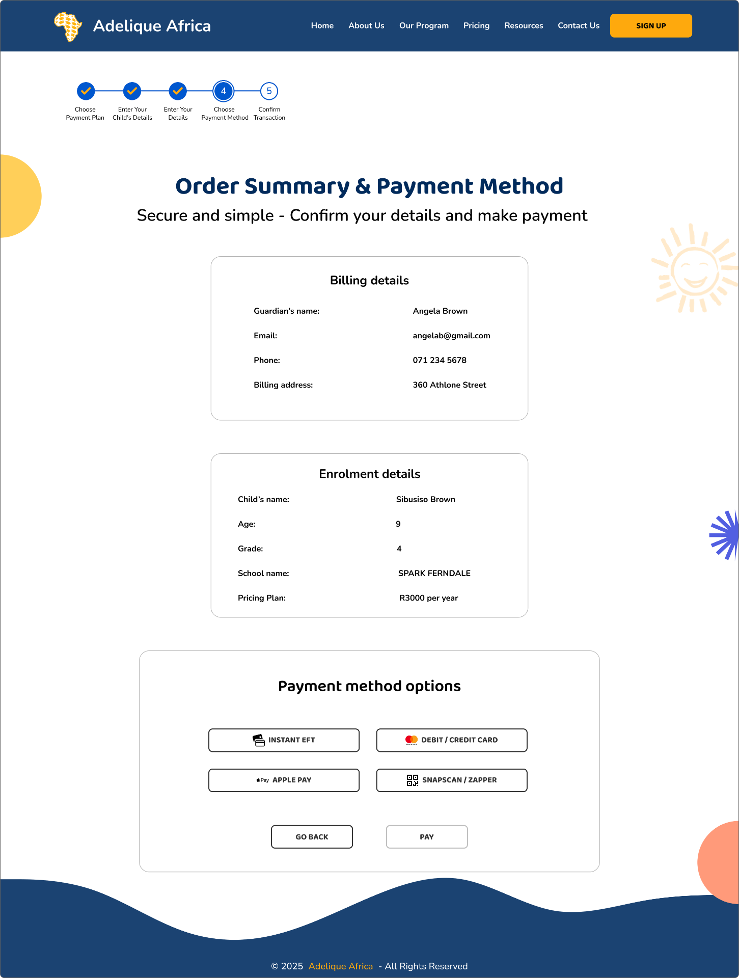
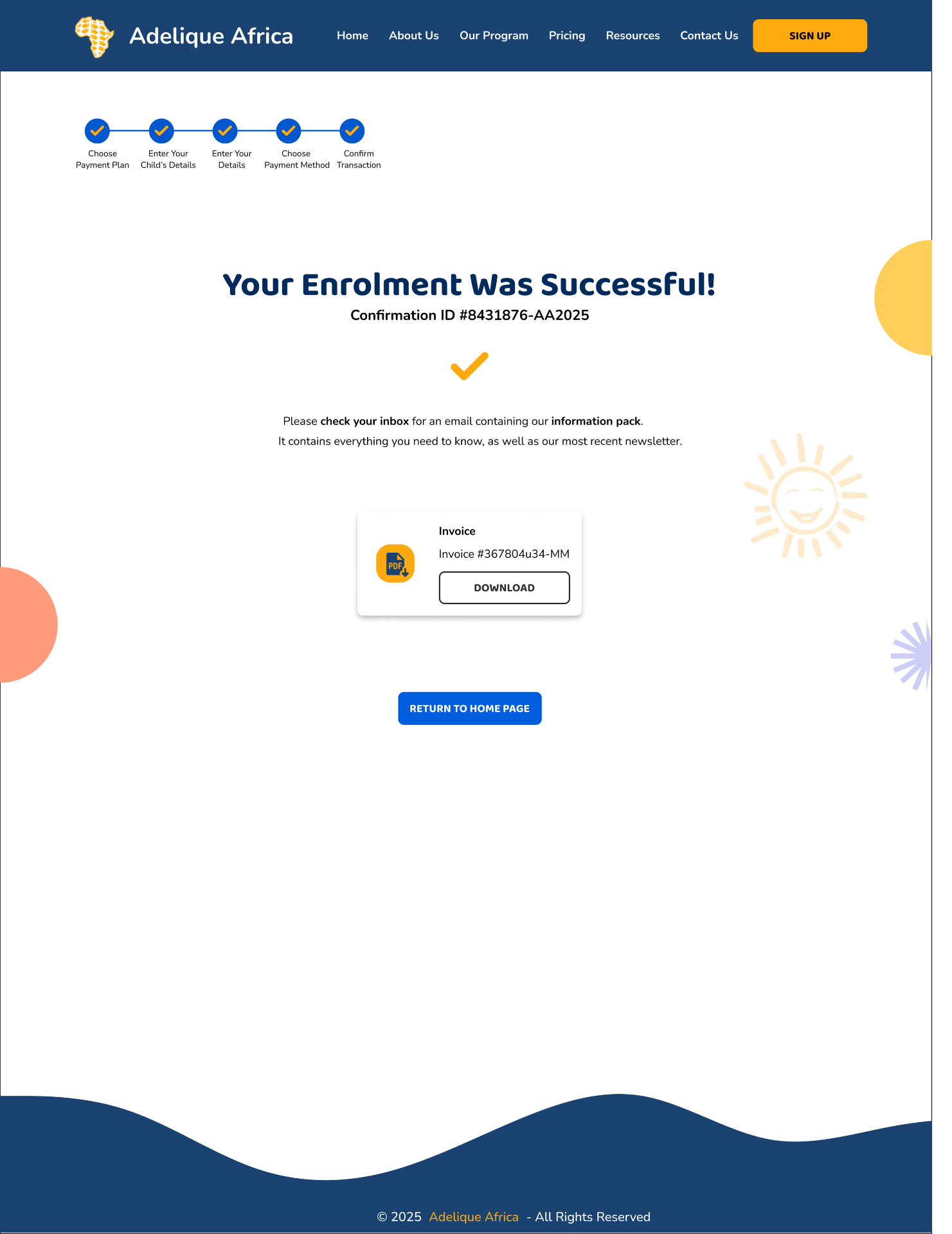
The team agreed on simplifying enrollment into three clear steps after usability testing showed parents dropping off during a long, multi-page form. I was responsible for translating that decision into the actual flow: entering the child and guardian's details, choosing a payment method, and confirming the transaction; each step showing only what's relevant in that moment, ending with a clear confirmation and downloadable invoice so parents know enrollment actually went through. This directly addressed one of our four core problem statements: complexity in sign-up causes drop-off before enrollment.
Outcomes
Reduced Friction
Streamlined signup cut enrollment time and drop-off.
Built Trust
Transparent fees, facilitator bios, and clear communication reassured parents.
Boosted Engagement
WhatsApp updates and structured resources kept families involved.
Enabled Scale
Clear architecture and CTAs support school and volunteer expansion.
Inclusive Design
Accessibility checks and cohesive visuals ensured a child-friendly identity.
Adelique Africa now has a platform that parents trust, children enjoy, and educators rely on.
Reflection
UX Is About People, Not Just Screens
Test Early
Quick usability checks on low-fidelity wireframes validate ideas before over-investing in execution.
Visual Thinking First
Starting visual explorations earlier reduces last-minute design adjustments.
Audience Alignment
Confirming primary users upfront saves time and ensures designs meet real needs.
Clear Copy Matters
Small wording tweaks like 'per term' vs 'termly' significantly improve comprehension and trust.
Iterate with Purpose
MoSCoW prioritisation helped focus on high-impact changes without overcomplicating the design.