Case Study

SciELO South Africa: Usability Research

A lightweight, mixed-methods usability audit diagnosing friction on a crucial public-access academic platform.

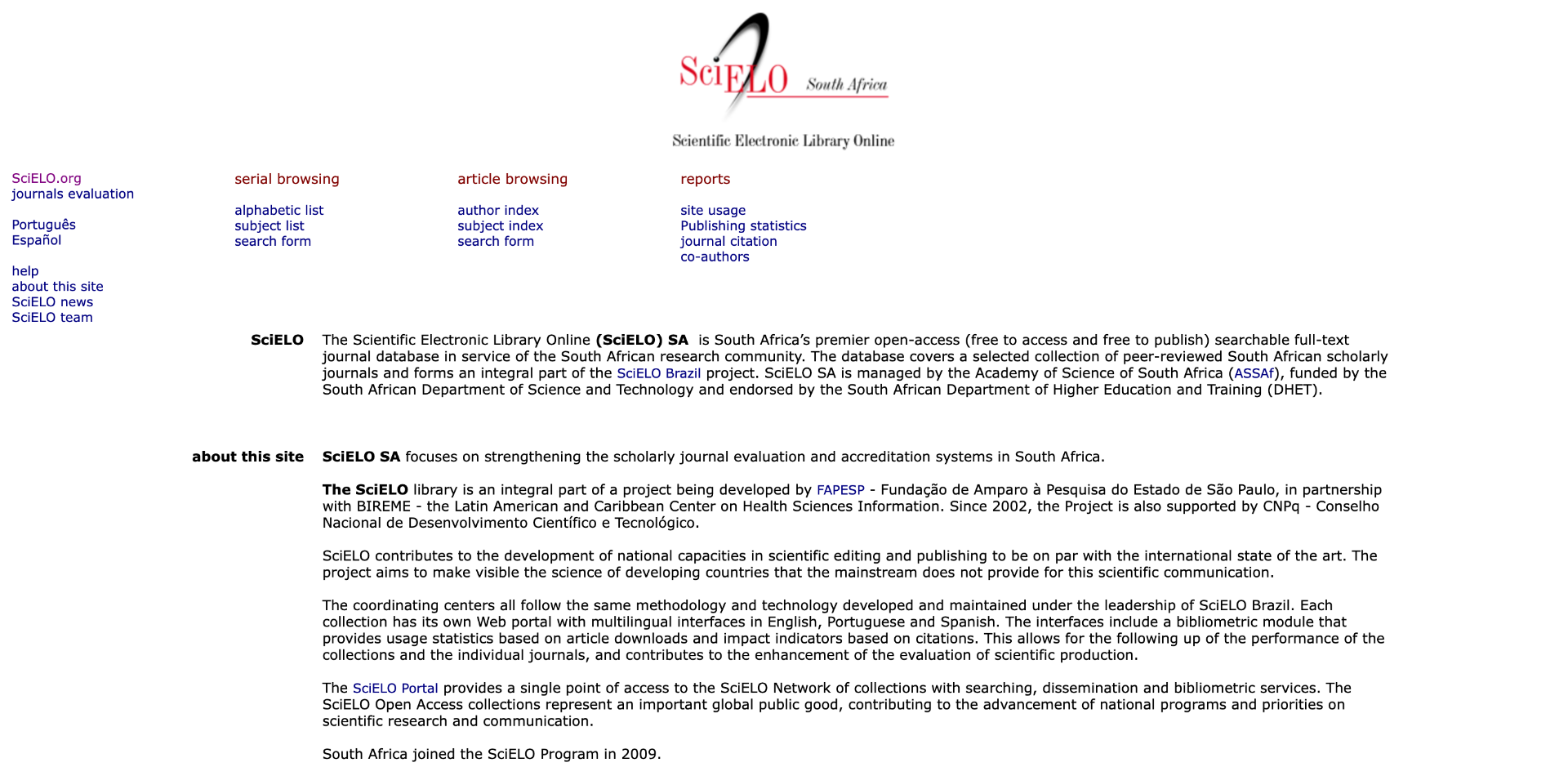
SciELO South Africa homepage with usability annotations123

Origin

Project Origin

I noticed usability friction on SciELO South Africa and ran a self-initiated audit to diagnose it. SciELO South Africa is a free, public-access academic journal platform that plays a crucial role in South African scholarship.

Timeline

2 weeks

Role

UX Researcher

Platform

Academic Web Platform

Project Goals

  • 01

    Investigate

    Examine where users encounter friction while completing common research tasks.

  • 02

    Uncover

    Identify patterns of usability issues across novice and expert academic users.

  • 03

    Propose

    Recommend clear, evidence-based improvements grounded in usability heuristics.

2

Participants

17

SURVEY RESPONSES

3

RESEARCH METHODS

3 core

Findings

Approach

Understanding the User Journey

I evaluated SciELO from three complementary perspectives: the interface, individual researcher experiences, and broader user feedback. This allowed me to identify usability issues, understand how they affected real research tasks, and validate recurring patterns.

01 — Heuristic Evaluation

Why?

I started with a heuristic evaluation to identify potential usability issues in the interface before testing how users experienced them.

What I did

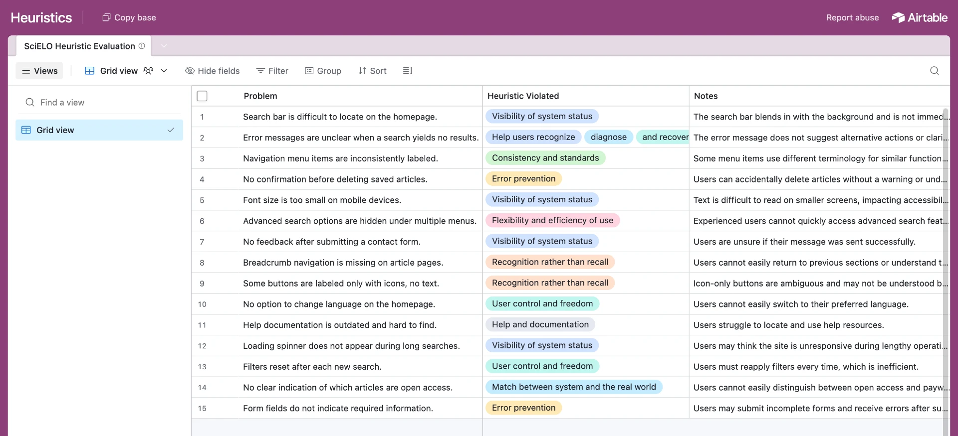
I evaluated SciELO against Nielsen’s 10 usability heuristics, focusing on core research activities including search, filtering, navigation, error recovery, and information scanning.

What I found

  • Visibility of System Status

    No loading indicators or actionable feedback during longer processes such as filtering or downloading PDFs.

  • User Control & Freedom

    No clear way to reset filters, while limited mobile responsiveness restricted flexibility.

  • Aesthetic & Minimalist Design

    Heavy text density, limited whitespace, and outdated iconography increased cognitive load and made results harder to scan.

Heuristic evaluation table listing usability problems and the heuristics they violate
Heuristic evaluation table

02 — Usability Interviews

Why?

The heuristic evaluation identified potential usability problems, but I needed to understand how researchers actually experienced them during real tasks.

Who I spoke to

I selected two participants with complementary perspectives: a graduate student representing a typical researcher, and a metadata librarian with expertise in categorising scholarly information and conducting research.

  • Graduate student — typical researcher
  • Metadata librarian — information organisation expert

What I did

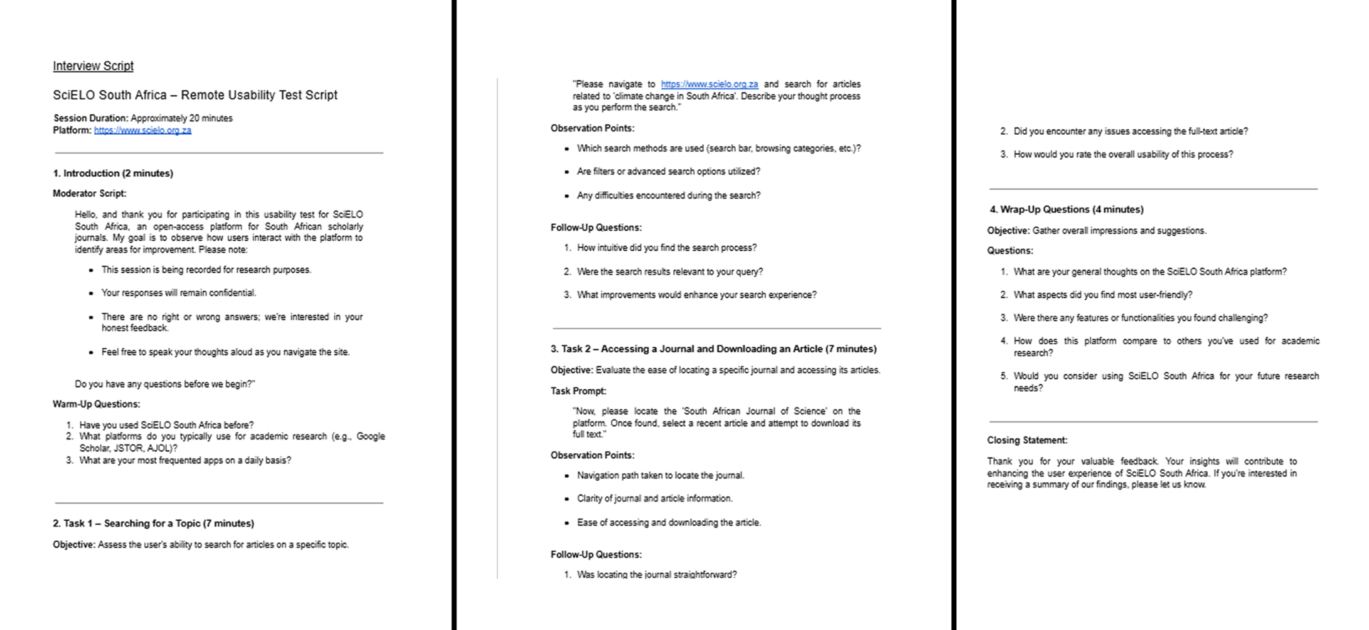
I used semi-structured interviews and task-based observation to explore how participants searched, navigated, filtered, and interacted with academic content.

The sessions revealed behavioural workarounds and points of friction that weren't apparent from the heuristic evaluation alone.

SciELO usability interview script and task-based observation framework
Interview script & task-based observation framework

03 — Validation Survey

Why?

The interviews provided depth, but with only two participants I needed to determine whether the issues identified were experienced more broadly.

What I did

I surveyed a broader group of researchers about their experience with SciELO’s core features.

What it gave me

The responses helped validate the frequency of recurring issues identified through the evaluation and interviews.

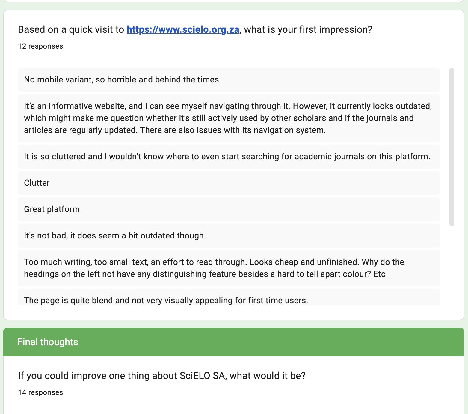
Survey responses validating recurring SciELO usability issues
Validation survey

Findings

Key Findings & Evidence

Across the heuristic evaluation, interviews, and survey responses, several usability issues consistently surfaced. These findings connected interface-level problems with the behaviours and frustrations experienced by researchers.

Finding 01

Search Entry Points Are Hidden

The heuristic evaluation suggested search visibility issues, which user testing confirmed:

Z
Zizipho (Metadata librarian)
"I couldn't immediately locate where to start searching. The homepage didn't show a clear search box or icon."
A
Ayanda (Honours student)
"I wasn't sure if there was a search function at all. It wasn't obvious, which made me hesitant."

Survey Validation

68%

of survey respondents struggled to locate the search bar.
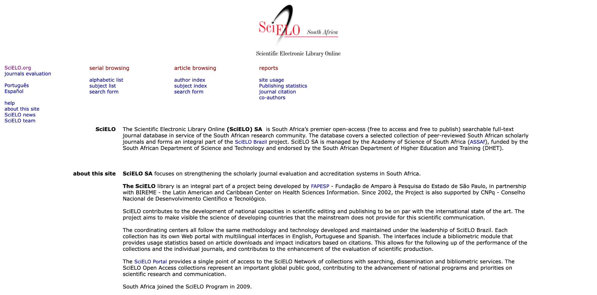
Cluttered SciELO Homepage UI showing missing search bar entry point
Cluttered SciELO Homepage UI showing missing search bar entry point.

Finding 02

Filters Are Deeply Buried and Opaque

Z
Zizipho (Metadata librarian)
"The filters felt buried. It took extra clicks to find them, disrupting my workflow. … a missed opportunity for learning."
A
Ayanda (Honours student)
"The filters were confusing. The labels didn't explain what they meant, so I wasn't sure which ones to pick."

Survey Validation

74%

of users found filters difficult to understand.

52%

avoided filters due to uncertainty on how to use them.

Confusing SciELO filter panel
Overwhelming and unclear filters.

Finding 03

Navigation Contradicts Research Workflows

Survey Validation

60%

of users found navigating categories confusing or requiring too many steps.

Z
Zizipho (Metadata librarian)
"I often used my browser's search instead of the site's navigation because it was easier."
A
Ayanda (Honours student)
"I got lost a few times — I didn't know where to click to find related papers or get back."

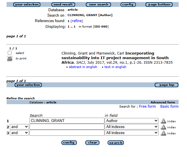
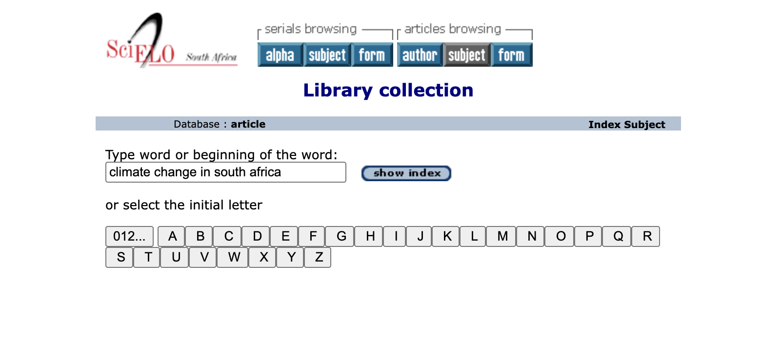
01 / No Clear Path In — Users land on a rigid index page with no visible route back to browsing or the homepage, forcing them to start over rather than navigate forward.

SciELO step 1: index inquiry screen

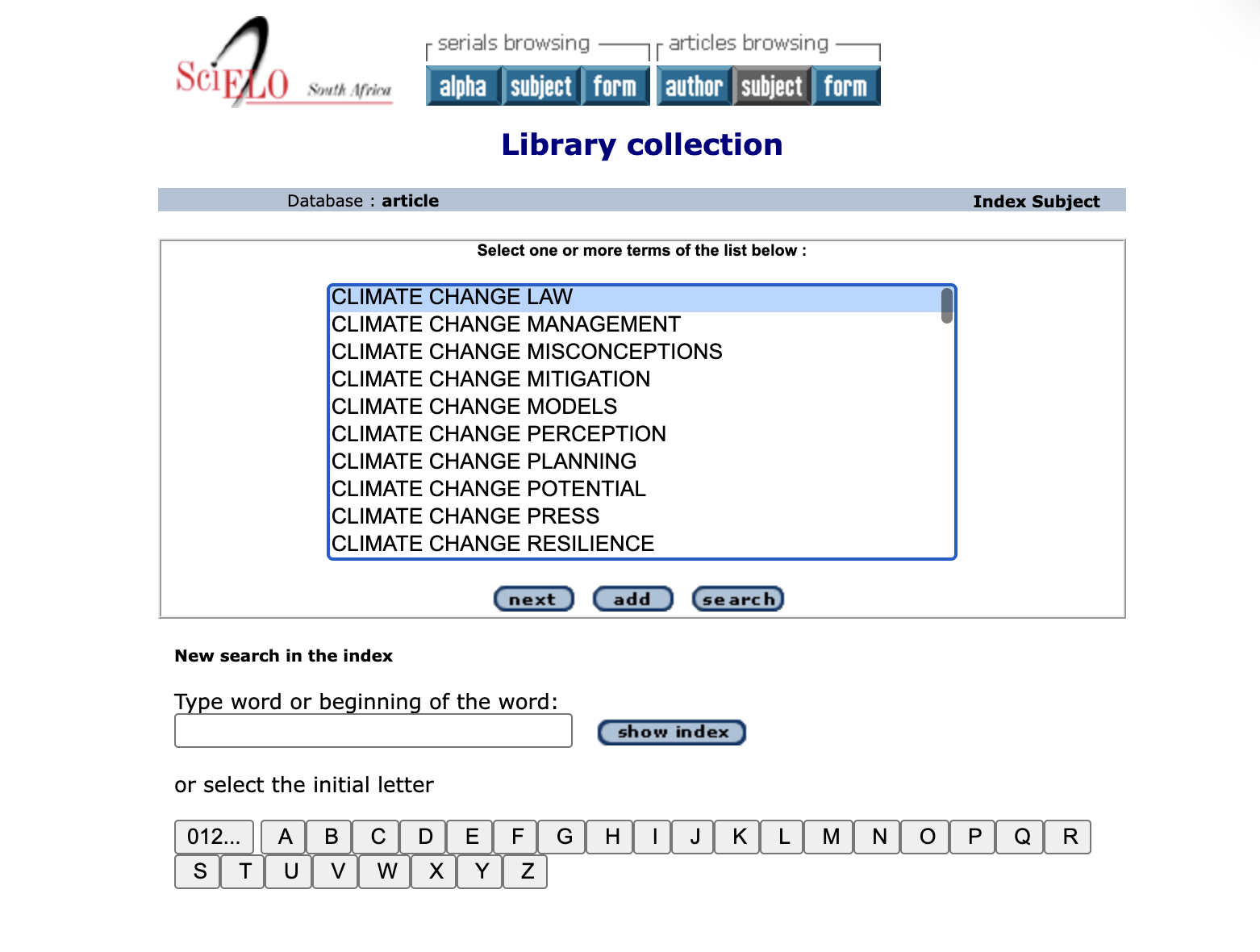
02 / Dead-End Selection — This index-selection screen offers no breadcrumb or 'back' option, so users lose their place in the site the moment they commit to a term.

SciELO step 2: string selection screen

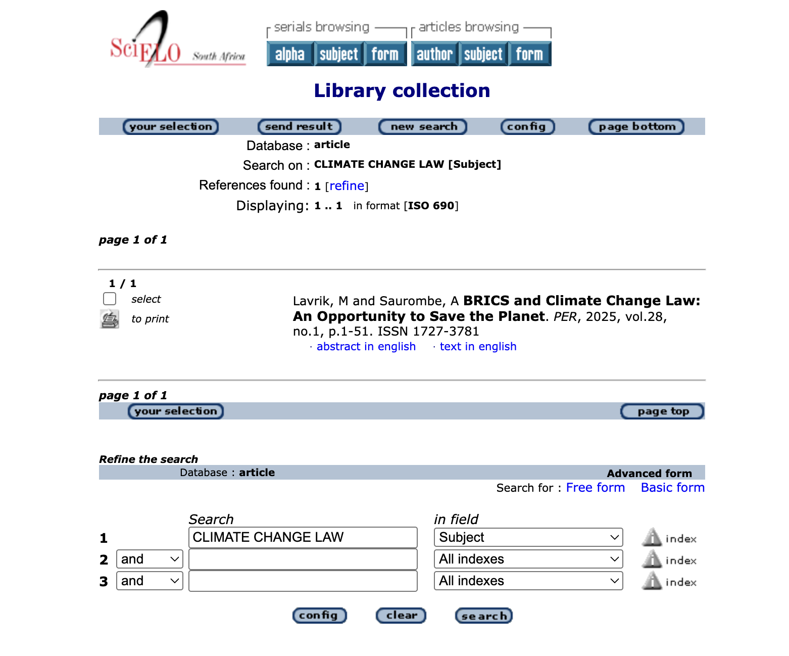
03 / No Way Back or Forward — The citation page buries any link to related work or the original collection, leaving users stranded with no next step but the browser's back button.

SciELO step 3: fragmented results screen

Strategy

Strategic Recommendations

01

Enhance Search Visibility

Introduce a prominent, persistent search bar in the primary header with clear iconography and placeholder guidance.

02

Simplify Filter Design

Rewrite filter labels in user-facing language, group by intent, and expose the most-used filters by default.

03

Align Navigation with User Mental Models

Restructure the Information Architecture around research tasks (browse → search → read → cite) rather than internal content categories.

04

Implement Contextual Onboarding

Add lightweight in-context tooltips to introduce advanced search operators and filter behaviours on new users.

Reflection

Reflection

This project let me combine two passions: research and improving access to education, while deepening my qualitative research practice.

My background in sociology shaped how I approached the interviews by asking thoughtful, people-centered questions. This was a look at how design can either support or block access to knowledge, especially for users who rely on public tools like SciELO.

After interviewing Zizipho and Ayanda, feedback from my mentor reshaped how I think about usability testing. I learned to set more realistic scenarios, consider users' real context (like when and how they last used academic tools), and avoid guiding participants too much during tasks: changes that make space for more honest, useful insights. Even with just two interviews and a small survey, this approach surfaced real, actionable findings.

01

Prototype Next

Follow up with low-fidelity prototypes to test possible solutions.

02

Benchmark Against Peers

Run a comparative analysis against similar academic platforms like Google Scholar or JSTOR.

03

Widen the Sample

Expand the participant pool across disciplines and institutions to strengthen the evidence base.

04

Close the Loop

Share findings directly with stakeholders at SciELO or in the academic community.